Using a readily identifiable ‘Access to information’ icon on government websites makes it easier for people to access information held by government, regardless of the jurisdiction.
By acting as an immediate visual cue, a single, uniform, public-facing icon facilitates access to information, regardless of the structure of individual agencies’ websites or the user’s knowledge about how to access government information.
This approach is recommended in our Guidance for agency websites: ‘Access to information’ page.
The OAIC has a new icon available for all agencies to use. We encourage Australian Government agencies to download and use this updated icon to ensure their content is up-to-date and consistent across government. This approach furthers the objects of the FOI Act.
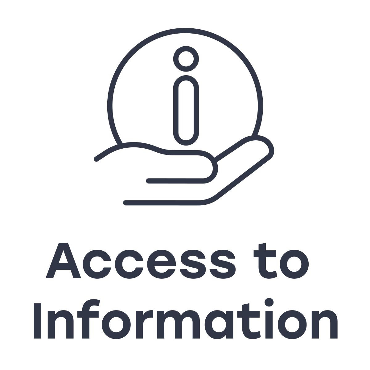
‘Access to information’ icons


Download the Access to information icons (ZIP, 22MB)
Instructions for use
For maximum visual recognition it’s important that the icon is displayed consistently across government. The following conventions will help ensure the ‘access to information’ icon is immediately recognisable.
- It’s intended that the icon appear on the agency’s home page, for example, in the footer.
- Background: the icon is available on both a white and dark background. The colour of your agency’s website will determine which one to use, noting the accessibility requirements below.
- Colour contrast: for accessibility purposes, a colour contrast ratio of at least 3:1 is recommended.
- Alternative text: adding alternative text ensures people with visual impairments can use the icon (without alternative text screen readers will ‘skip over’ the icon).
- Clear space: the icon should appear on a plain background. Don’t place it on a high contrast or busy background.
- Minimum size: the icon should be at least 9 mm in height (horizontal version) and at least 13 mm in height for the portrait version.
- Font: the icon font Stolzl can be accessed from the Adobe Fonts platform.
- Legibility: the icon can appear over images with a plain background to allow for legibility.
- Don’t add elements or effects to the icon, or alter the size of icon elements, rotate the icon, or change its colour.
The ‘access to information’ icon should link to a landing page that has information about the different ways people can access to your agency’s information, for example, administrative access, freedom of information, the disclosure log and your agency’s Information Publication Scheme.
Further information about how to display the icon can be found in the Style Guide (PDF, 532 KB).


